
Nibs: a comparison
When I got into regularly drawing with dip pens, nibs were easy to find at the local art store and I could get them for thirty cents a piece. So it wasn’t too hard to try out different kinds. These days, not all art stores carry nibs and they tend to be around one to three dollars each. They’re still pretty cheap for an art supply, but you have to actively seek them out, usually from on-line retailers (I’ve listed some at the bottom). Since trying out different models takes a bit more effort, it helps to narrow your search a bit. One way to do that is to find out what nibs your favorite pen-and-ink artists use. The other way is to look at guides like this one.
Finding a nib you like is a matter of taste. But there are certain qualities to look for in any nib (in each category a spectrum is possible):
Thin line – Thick line
What is the size of the line produced when standard pressure is applied to the nib?
Smooth – Scratchy
How does the nib feel on the page?
Stable – Flexible
How does the nib feel as you increase pressure on it?
Steady – Elastic
How quickly does the nib return to its original shape?
High modulation – Low modulation
How much variation can you get out of the line created?

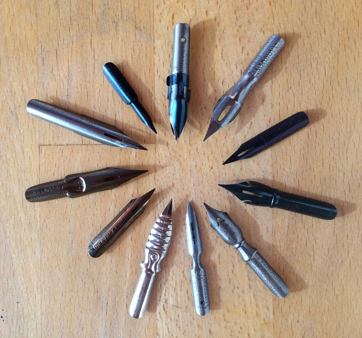
The following is a brief overview of a few pointed pen nibs. This is by no means an exhaustive list; it’s just a few of the more common nibs I’ve used and enjoyed. This list moves roughly from thick line nibs to thin line ones (or right to left in the image above).
 |
 |
Brause 76
I hadn’t heard about Brause nibs when I started out. What I have discovered is that the Brause nibs are consistently the best made nibs I have ever tried. The 76 is also called the “Rose” due to the little rose embossed on the shaft. It’s a fairly large nib and so creates wider lines, but it is incredibly flexible. The 76 is the closest thing to inking with a brush of any nib I’ve tried. It’s a lot of fun.
 |
 |
Hunt 512
This is a stiff, not very flexible nib with a smooth feel. It has a “bowl tip”: meaning that the point is rounded slightly. This makes drawing curves easier. I used to use this nib for all my lettering, but have stopped because it seemed like the 512s were getting scratchier and more frequently defective. I feel that the Hunt nibs have really gone down in quality over the years.
 |
 |
Leonardt 30
This is the nib I use for lettering now. Leonardt nibs have recently made a comeback. The 30 is solid and stiff, which works well for consistent lettering. It’s a lot like the Hunt 512, but with a bit more modulation possibility and a smoother feel.
 |
 |
Zebra G
Comics artists inspired by manga are often turned on to the fabled “G” nib. In my limited experience, the Zebra G nib is better than the Nikko G nib. It’s not very flexible, but delivers very controlled lines. For a larger nib, the line it creates is actually fairly fine. The nib feels strong and it lasts a long time. Personally, I find the nib a bit too scratchy and inflexible for my tastes. The Tachikawa G is slightly more flexible (maybe I’ll post a comparison at a later date).
 |
 |
Gillott 303
This is a reliable nib with a bit of flexibility. While there are smaller Gillott nibs, I’ve found that the 303 actually can produce a thinner line than many of them. So this is a good nib to start with if you want to try a nib from Gillott. Overall though, I find the 303 a bit too scratchy for my taste, and this is true of all the Gillott nibs I’ve used.
 |
 |
Esterbrook 356
I got this nib on eBay. Esterbrook was a standard line of nibs once upon a time. From what I’ve tried, all their nibs are solidly built. The 356 is a bit stiff and doesn’t offer a lot of line variation.
 |
 |
Brause 66ef
I used this nib when I drew Carnivale. It produces a fairly fine line, but has a very springy feel. Even so, it is easy to create a stable line with the 66ef. When you vary the pressure on the nib, the line fluctuates evenly. It doesn’t suddenly swell or drop off. I think this is due to the quality of the metal used to make the nib. While the point of the nib is fine, it is also slightly rounded, like the Hunt 512. That means that you can almost draw a circle with one stroke, versus composing a circle from two strokes as you have to do with most nibs. It also has a good ink capacity, so you can create long, flowing lines. Overall, it’s a nice nib and would be a good nib to start with if you wanted a fine line.
 |
 |
Brause 511
This is my favorite nib and the one I draw with most often now. When I first used this nib I liked how smooth it was, but I thought it was a bit too unyielding. Yet this was due to the fact that I was coming off using the Hunt 100, which is the most elastic nib out there. The Brause 511 is not very elastic, but capable of a nice bit of variation if you apply the pressure. Don’t be shy with it; bear down and see what it can do. Since it is more stable and steady, when you apply pressure, the nib smoothly comes back to a thinner line. You might be able to see the contrast with the Hunt 100. With the 100, the line drops back quickly to a thin line, making for a little cliff after the large swell. The 511 modulates at a more consistent rate. So this nib offers a lot of variability while not sacrificing control. And it feels like a dream on the page. This is why I love this nib so much.
 |
 |
Hunt 100
At one time, the Hunt 100 was my main drawing nib. What I love about it is it’s incredible springiness. The nib is very elastic and flexible. Because of this, it takes a steady hand to control it, but it is capable of making some very expressive marks. Yet the flexibility of the nib also means that it’s not very good for hatching, at least if you want a consistent size to your hatch marks. There are two main reasons that I no longer use this nib. One, it wears out fast. The elasticity of the nib is due to the lightness its metal and this light metal wears out quickly. Second, this nib has made me want to scream one too many times. There is nothing more frustrating than wanting to draw but having no ink flow from your pen. I’ve had this problem more often with the Hunt 100 than with any other nib I’ve ever tried. When I was more inexperienced, I thought the problem was me (and sometimes it was). But I’ve since realized that it’s mostly the nib. So, this is an expressive nib, but not one that you want to rely on. Honestly, this nib has caused me more frustration than any other.
 |
 |
Hunt 102
This is a small tubular nib, which, unsurprisingly, creates a very fine line. So if you want small marks, this is a nib to try. I’ve found though that at a certain point, lines can get so small that they don’t reproduce well. Since I create comics, this is a concern for me. So I find the 102 too small. The Brause 515 is a similar nib, though not quite as thin, yet with a much smoother feel.
On-line nib retailers:
JetPens
Pen-and-Ink Arts
Scribblers
Other on-line nib guides:
Beepily
JetPens

(written December 23, 2016)
I prefer the Brause 515 to the 511, really. just feels smoother to me. I usually prefer the Zebra G for most drawing, but recently I’ve also been loving the smoother flex of the Brause 515b. Ever tried the Conte/Bic Plume Atome? it’s the work horse of the french comic industry, I think. it’s a weird, small, scratchy nib, but I love it for life drawing.
All the Brause nibs I’ve tried are really nice. So much better than the Hunt nibs that most stores in the U.S. carry. I just like the smooth swells I can get with the 511. It’s all a matter of taste, though.
I’ve never heard of the Plume Atome. I see you can get them through Amazon France. Where did you get yours?
Thank you so much for the clear and methodical comparison! I have a handful of nibs and always gravitated towards Hunt and Tachikawa G nibs….however very excited about Brause, just love the variation and smoothness.
Glad this was helpful. When I first discovered the Brause nibs I was really impressed by them (and I still am).
And I agree that the Tachikawa G is the best G nib:
https://nijomu.com/pen-and-ink/g-nibs-a-comparison/
I just posted about the various types of Brause nibs that I have tried:
https://nijomu.com/pen-and-ink/brause-nibs-a-comparison/
Hi! I love reading your nib reviews, they have been really useful in helping me find new nibs to ink with! Thank you! Your comics and art are just beautiful, and I’ve subscribed to your RSS feed! It’s so cool to find someone else out there who loves dip pen nibs. Most reviews I see for them seem to be in the context of calligraphy, so it is great to find another comic artist using them, too!
Have you ever tried the Hunt #108? I use it but I’d to try out the Brause Rose, because as much fun as the #108 is, it has its drawbacks for sure. (It hates being used at certain angles and shreds the paper, not to mention its tiny capacity) I was curious to see if you had experience with both.
I think the #108 is Hunt’s most flexible nib, at least in my experience. I’ve tested pretty much all of their nibs except some of the monoline ones and the 513. It is REALLY crazy and quite brush-like. I think that it needs a nib cage to work for anything bigger than about A6 size, but if you can get one to work with it, it’s FUN! I definitely liked it a lot better than the #100 (which made me want to cry more than once trying to get it to work when I wasn’t busy accidentally breaking them, hah!).
Hunt’s nibs seem to be SO hit-or-miss on quality. I love the #99 but I had to quit using it because out of six I bought recently, FIVE were straight-up defective and tore up my paper. I switched to the Brause 361 and am now obsessed and need to try more Brause nibs! (and I checked out your post on them)
Hope you have a great day!
Thanks! I’m glad the reviews have been helpful.
I’ve tried the Hunt 108, but had forgotten about it. Yes, it’s a lot more flexible than the other small tubular nibs, like the 102 and 107. It does seem to be as flexible as the 100, but a lot easier to use. I’ll play around with it for awhile. Part of my issue is that I don’t like the holder I have for nibs like the 108. The Brause 515 is a very similar nib. Too me, it’s a little smoother than the Hunt 108, but maybe a tad wider line.
The Hunt 22 is also a nice nib, though stiffer.
And yeah, the Brause 76 (the rose) is fun, but much bigger than the Hunt 108. So you get a much broader line.
Thank you so much for the insights! I think I’ll give all of those a try! 🙂 I really like broad lines so it sounds like I might really like the 76. I have heard it is a bit cantankerous to get going, but I recently switched to a really fast-flowing ink and have found that has tremendously helped me with the more finicky nibs. The 515 also sounds like a winner!
I’ve found for finer lines I like stiffer nibs specifically for that purpose- stuff like the Tachikawa T-05, Spoon nibs, the Hunt #107 and the #104 (this one makes the finest lines out of all the nibs I’ve tried- I can get it thinner than my Copic Multiliner 0.03mm pen) or the Tachikawa T-99… Usually if I’m trying to get hairlines I don’t want something that I’ll accidentally flex and ruin my linework.
I also forgot, but I realized that I didn’t mention the Hunt #103, which is also pretty brush-like and quite nice. I think with it even puts down a thicker line than the #108, and it had a LOT better capacity in my experience. It’s a bit flatter shaped than the tubular nibs, and it doesn’t seem to have as much trouble catching on upstrokes as the #108. It actually looks very similar to the #100! I dunno why I don’t use it very much, but it’s pretty great for drawing.
I have trouble finding a good holder for tubular nibs that doesn’t hurt my hands if I use it for a long time. The Tachikawa/Deleter free holders are pretty good, but I like something with a bit more weight and heft to them. The only time I use those specialized holders is if I’m trying to keep a nib from flexing and I want the lines as thin as possible. Actually, I like really long holders (like the Speedball standard, but those aren’t all that great quality IMO. I’ve had two break in the last month), but trying to find one that fits those tiny nibs is a bit of a challenge.