

Inking: Black on Black
Working with pen and ink, you often run into the issue of what to do when you have a black element on top of another black element, such as when there is a black figure on a black background.


If you simply put the two together, you lose the form of at least one of the elements. Here, the figure becomes less legible.

So what are the options?
Offset the Elements
The issue is that the black of one element completely subsumes the black of another element. So one option is to arrange your elements so that this doesn’t happen. You keep the elements as solid black, but offset them so they are readable.


Benefits
- strong blacks
- elegant
Drawbacks
- must be planned carefully
- hard, heavy look
Here is an example of this approach from Marc–Antoine Mathieu’s graphic novel Le Dessin.
And here you can see an example from the great José Muñoz.
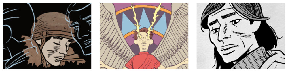
White Line Outside Figure
One option is to put a white outline around the elements. Here, the black of the background stops before it meets the solid lines of the figure.

Benefits
- clean
- easy
Drawbacks
- weird halo
- disconnects figure from background
You can see this approach in Jim Woodring’s Frank.
White Inside Figure
The opposite approach is to put the white buffer inside one or more of the elements. Usually artists use this white to highlight the three dimensional surface of the element and create lighting effects.

Benefits
- enhances sense of lighting
- enhances sense of volume
Drawbacks
- can shrink the figure
- hard edges
- resulting shapes can be confusing
Here’s another example from José Muñoz, specifically from Billie Holiday.
Shading in Background
Instead of solid black and white, one always has the option of hatching or stippling. In this case, the shading is done outside the foreground element.

Benefits
- increased tonal values
- softens the line
Drawbacks
- can look messy
- can create halo effect
You can see an example in this page by Lorenzo Mattotti.
Shading in Figure
Conversely, you can do the shading in the foreground element. As with adding solid white inside a figure, this can create a sense of volume and lighting.

Benefits
- sense of volume
- sense of lighting
- softer edges
Drawbacks
- can look messy
- can make the figure look less bold
You can see this approach in this page by Yoshihiro Tatsumi.
So which is correct? None of them. The correct answer is to give up art and become an accountant.
Seriously, it’s a matter of style and taste.
That said, I tend to prefer the approaches that do things inside the foreground element, or the figure in these examples. These approaches create more visual interest within the figure and so naturally draw the viewer’s gaze to the figure. When you complicate the background, you emphasize the background. Of course, this could be what you want to do in a given situation, but, still, you want to do it intentionally. And my goal here is to make us all more intentional in how we approach dealing with black on black.