
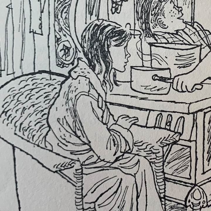
drawings for A Spell is Cast by Beth and Joe Krush
I was at a friend’s house and pulled down one of their childhood books, which turned out to be A Spell Is Cast. I was taken with the illustrations (of course). They looked familiar and it wasn’t until I got home that I remembered that I had seen the work of the Krushes online years ago. They are best known for doing the illustrations for The Borrowers.
While their style is of a particular time period, their line work is really incredible. They are able to be rough and simple while also being realistic and clear. As I was looking them up again, I also found that Jesse Hamm used them as an example in one of his Twitter posts. What he points out is their design sense and how they often leave areas blank. Instead of neurotically filling every form in, they leave some empty, which tends to heighten the focal point of the drawing. Look at the furniture and foliage in the following frames.


