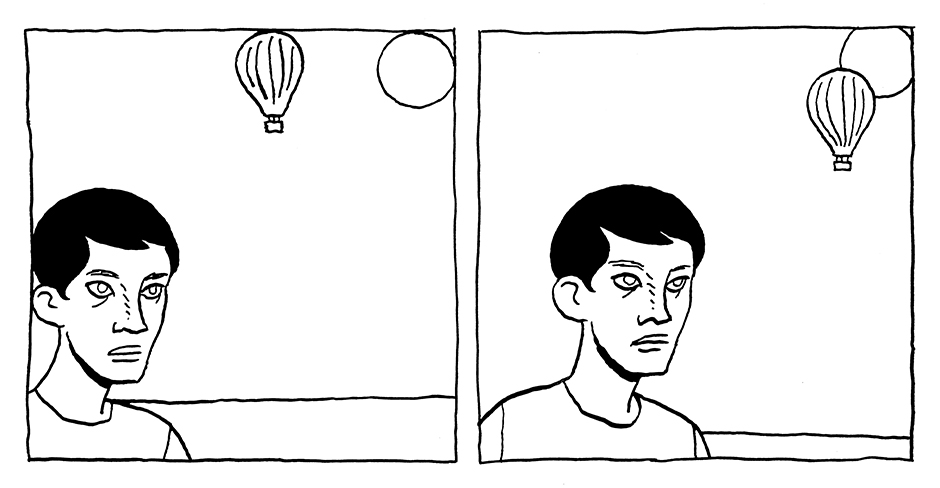
Panel: tangents
As I mentioned, I’ve been looking through the old Famous Artists Cartoon Course. Lesson 11 is all about panels and has a lot of solid advice. One thing that is mentioned in that lesson is what they call “contact points,” but what I’m calling “tangents.”

Basically, since most comics drawing is contour drawing, you need to make sure that your contours are legible. Clarity comes with clearly defined forms. If the lines that define the forms meet tangentially, then things can get confusing. As the FACC mentions above, it can also make the sense of space muddy. This is why it is so important to either separate your forms or overlap them.
I read a similar idea years ago in The Complete Book of Cartooning by John Adkins Richardson (though given the publication dates, Richardson was probably inspired by the FACC, if anything). Richardson, however, expands the terminology and creates three categories: “ambiguous alignments, tenuous contacts, and distracting parallels.”
In comics, since the panel is also a shape, this problem of tangents can apply to the panel border itself. If a form meets tangentially with the panel border, it can feel like it’s stuck there. And, again, it makes the sense of space unclear.

For me, not only is the panel on the right easier to read, it has a greater sense of depth. Unintentional tangents inhibit clarity and flatten space.


