Kandinsky on comics
I just read through Wassily’s Kandinsky’s book on art theory, Point and Line to Plane (I got this from the Guggenheim online). As the title indicates, in the text Kandinsky meditates on the elements of the point, which then creates the line, which, when closed, leads to the plane. There is a lot that is practical or at least theoretically engaging in this book, but it’s also a wild ride. People argue about whether or not Kandinsky had synesthesia, and regardless of whether or not he actually did, this book talks about art in a synesthetic way. Kandinsky often gives visual elements colors, sounds, and even temperatures. It’s interesting, but the connections are so personal that the book is often a walk through Kandinsky’s private associations and less an exploration of theory. That said, there are a lot of things that I found interesting.
The first chapter is about the point (naturally). This part is of less interest to me, but he makes the point that a single point on its own has a loud sound. Again, this is a synesthetic way of saying that a single point makes a bold impact. And, as we all (probably) learned in math class, when a point moves it creates a line.

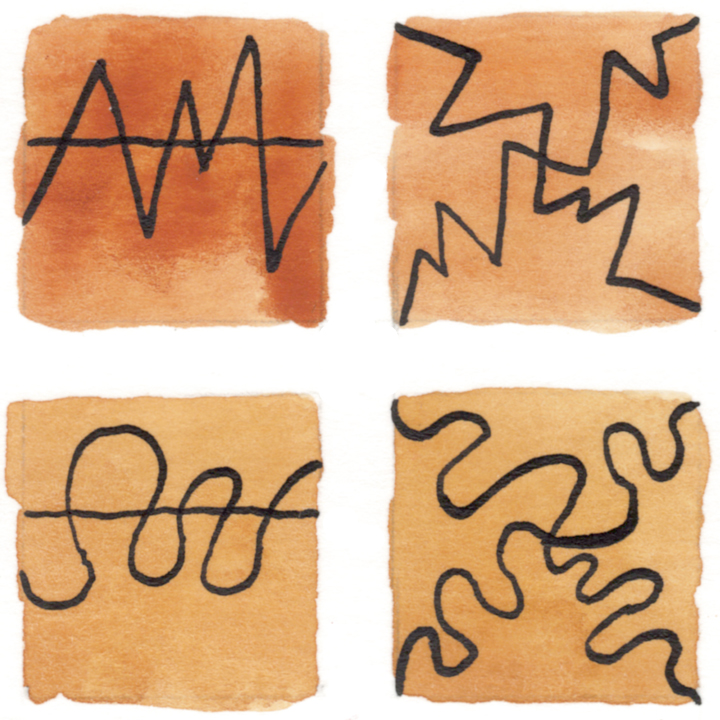
Once Kandinsky gets to line, he attempts to categorize the different complexes, or rhythms, that lines can have when placed together (94). His goal is to have a scientific taxonomy that we can then use to talk about and understand art. I’ve read enough theory to know that the golden idol of the perfect critical method is impossible, but it is always good to have vocabulary to describe what we experience, and using a critic’s pair of glasses helps us to see connections that we wouldn’t have discovered otherwise. So I made my own little comics chart based on Kandinsky’s ideas.

When Kandinsky gets to the concept of the plane, he often presents examples that look exactly like comics panels. So of course, I immediately applied his insights to comics and graphic novels.

A lot of what Kandinsky discusses starts out similar to ideas that I’ve heard before or even wrote about (such as here and here). For instance, he states that the right side and the bottom of a plane have a greater weight. Because he’s thinking of composition and not reading, these insights lead Kandinsky into places that don’t come up in comics theory.

One idea that he posits is that the bottom of a panel has twice as much weight as the top. He even sets forth a ratio (118). To put this into practical terms, the top of a composition needs to have twice as many elements as the bottom for the image to be balanced.

Kandinsky also offers a unique list of adjectives to describe the various weights of the sides of a panel. They describe not only weight, but also character. Such as:
- above = lightness, looseness, disintegration
- below = heaviness, constraint, condensation
The corollary to this is that if the bottom of a plane or panel has the greatest weight, then a line that moves upward has the greatest force since it has the most to resist. Think of a rocket blasting off. Building on that idea, vertical lines that move in opposite directions have greater contrast than horizontal lines that move in opposite directions. Again, this is because the vertical lines are working against or towards a greater force.

Kandinsky makes the observation that when a line touches the boundary of a plane, or, in our case, the panel border, that it loses its force. It becomes a part of the plane instead of its own element. This is something that I’ve stated myself, though I was thinking about this in the context of attempting to create a sense of depth in a panel. The panel border is two-dimensional and so elements that are tangential to it tend to look two-dimensional, also. Or at the very least they look stuck.
Before Kandinsky closes his book with a sequence of diagrams that illustrate his ideas, he offers his definition of what theory should do:
- to find the living
- to make its pulsation perceptible, and
- to determine wherein the living conforms to law (145)
I wouldn’t word things like this myself, but this is exactly what I like best in theory and criticism. When it works well, it shows you what is good, makes you see why it is good, and explains how it fits into a larger context. This is an intention that we all could navigate our own little boats by.
As I said, I got my copy of Point and Line to Plane from the Guggenheim. A lot of art museums have old out-of-print texts available to view online or download.
Getty
http://www.getty.edu/publications/virtuallibrary/index.html
Guggenheim
https://archive.org/details/guggenheimmuseum
The Met
https://www.metmuseum.org/art/metpublications/titles-with-full-text-online


The book is now available through Internet Archive:
https://archive.org/details/pointlinetoplane00kand