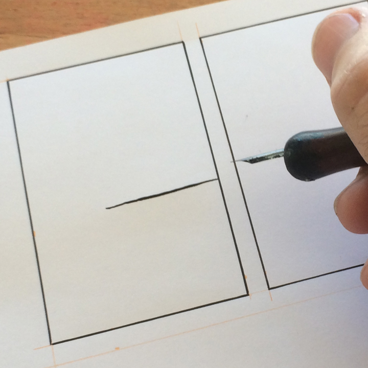
inking issues: at the border
When using a nib, it is very common to release pressure as you near a border, whether that be a panel border (as shown below) or the contour of a shape. You do this because you are approaching the end of your line and you don’t want it to cross over the conscribed edge. But, as my old track coach used to say, this is giving up before the finish line. The result is that your line tapers off as it gets close to the border.

Not only does this weaken the line, it also hurts the sense of depth, since it looks as if the border influences the line instead of just being a neutral frame. If you look at the second line below, it looks more clearly like it continues behind the panel border.

This is something I heard Jeff Smith talk about at the SPX in 2013. He said that many artists let background lines taper off as they approach the border lines of the foreground figures. The working assumption is that things in the background are not as dark, so the lines should be thinner. But Smith pointed out that this hurts the sense of depth. It weakens the interaction between the foreground and background lines. I am a slow learner and knee-jerk contrarian, so it took me years to come around and realize that he was right.
So if you notice this, an easy fix is just to go back in and thicken up your line. I recommend doing this when the ink is dry, because wet ink in wet ink can blob up and ruin your line.

This problem is very common with freehand hatching. If you are moving quickly, you don’t want to accidentally go over the border, so you stop your hand with space to spare. The result is a white halo between your hatching and the border.

So either go more slowly and carefully with your hatching, or, as below, go back in when the ink as dry and fill in the white space. I find it helps to start your hatch lines from the border itself.

Of course, no rules are absolute in art. There are times when you may want to end your lines or hatching before a border. For instance, when the border inscribes a completely black shape. If you hatch against the edge of a black shape, things can get muddy and difficult to read. Also, you may want to leave unhatched areas to create lighting effects. For me, the guiding principle in any decision is clarity of communication.


