
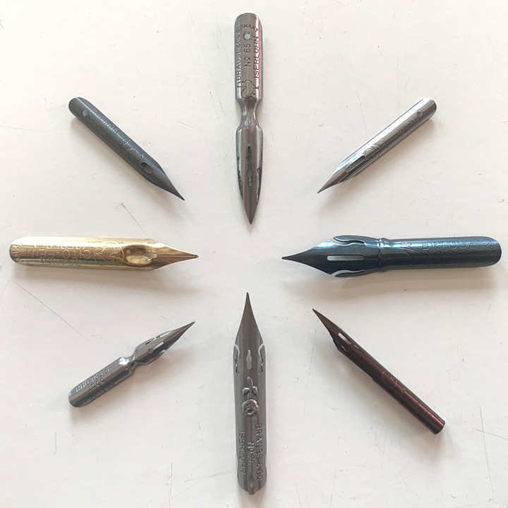
Brause nibs – a comparison
When I first got into pen-and-ink, I had only Hunt and Gillott nibs available to me. I enjoyed both brands and had fun experimenting with them, but over the years I developed a taste for what I wanted in a nib and the Gillott nibs felt too scratchy and the quality of the Hunt nibs declined. So I went looking for other brands. And the internet provided.

My search eventually lead me to trying out nibs by Brause. Brause was founded in 1850 in Iserlohn, Germany (you can see “Iserlohn” engraved on many of the nibs). Over 150 years of experience obviously means something; the Brause nibs are consistently the best made nibs that I have tried.
While Brause makes many nibs for calligraphy, several of them are good for drawing. So I wanted to take a look at the Brause nibs that I have tried and show you the properties of each. Again, my focus is on drawing and not all of these nibs are intended for that purpose.

Brause 65 – L’Ecoliere
This is a long nib with a stiff feel. It is fairly inflexible and attempts to create a wider line tend to result in ink blobs. It also railroads fast (see below). In short: it’s not a good drawing nib. In fact, it may be the only Brause nib that I don’t like. “L’Ecoliere” means student and I think this is based on an old school nib, one intended for students to use while taking notes. The nib works best for quick writing.


Brause 66ef
This is a small springy nib capable of thin lines and large swells. It has a nice flowing feel to it. But it is fairly springy, so any line you make tends to have slight modulation to it. I wouldn’t recommend it for lettering. The 66ef also holds a lot of ink for its size and so can go for a long time. I used this nib when I drew Carnivale and I highly recommend it.


Brause 76 – The Rose
This is a large nib that is incredibly flexible. It can actually create a fairly fine line for its size, but also swell to the widest line of any nib here. It’s the closest I’ve ever felt to drawing with a brush while using a nib. The 76 is a lot of fun. When it works. The biggest drawback to this nib is that it is often difficult to get started. It’s better to use a very liquid ink with the 76, such as Super Black. Also, as this video points out, you can get the nib started with a drop ink on your drawing paper.


Brause 361 – The Blue Pumpkin
This is a large steno nib which has a fairly nice range and can hold a lot of ink. Unsurprisingly, it creates wide lines, but with a light touch it can draw fairly fine. In many ways, it feels like a large version of the 66ef. Some people prefer the 361 to the G nib.


Brause 511
This is the nib that I use to draw with now. It is a solid nib, but, with a bit of pressure, it can be made to create smooth swells. I just love the feel of this nib. It’s solidness allows for control, but its flexibility makes for a lot of variability. It also doesn’t lose ink or railroad if pressed hard. It’s just a responsive, reliable nib. The potential drawback to the 511 is that it is very sharp and can dig into certain papers. Some people have found it too scratchy. Personally, I don’t feel that way.


Brause 513
This nib looks a lot like the 511, but is stiffer and feels scratchier on the page. If you want a less flexible version of the 511, that’s what the 513 offers.


Brause 515
The 515 is a small tubular nib, or crowquill, but ends up feeling a lot like the 511. Even though it is smaller than the 511, the 511 actually creates slightly thinner lines. Yet this nib has a nice, smooth feel. It’s very nice to draw with. Since this is a tubular nib, you will need a special holder for it.

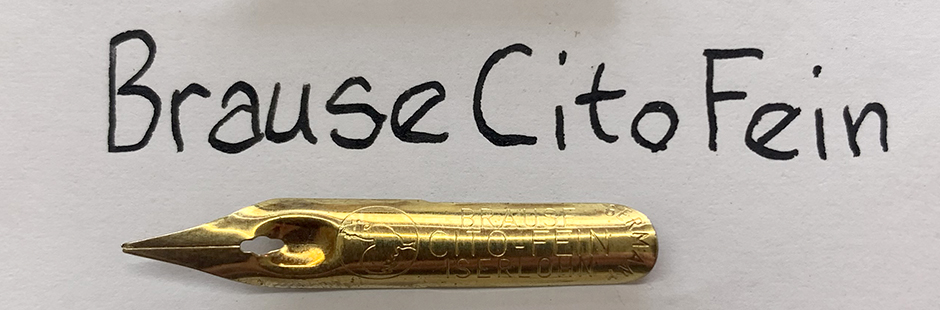
Brause Cito Fein
The Cito Fein is a monoline nib that is great for lettering. Being a monoline nib, the end of the nib turns up slightly, which is what makes the nib create consistent lines. The nib is not very flexible and so doesn’t allow for much line variation. However, this makes it a nice nib for lettering, which is how I use it.

Here you can see a comparison of the lines these different nibs make:

I order my Brause nibs from Paper & Ink Arts.
The 66ef and 361 can also be found at Jet Pens.
Hello there! I am here for the l’Ecoliere nib haha. I found a new love for dip pens and my favourite of the bunch i have (vintage and new) is a Lenonardt General which resembles the l’Ecoliere A LOT. I use the General for drawing and I find it delightful. Since I presumed the l’Ecoliere would be the original and the General the dupe (I don’t know why) I thought to look into it a bit. I find it interesting how you absolutely don’t like it for drawing. Should I just give it go? I think I will and try to compare, yay for dip pen nibs being affordable. Lovely post!
The two do look the same. If you like the Leonardt General, then sure, try out the L’Ecoliere. Maybe it fits your drawing style better than mine. I like to play with swells and I found the L’Ecoliere didn’t offer me much, at least compared to the other nibs. And, as I said, when I tried to modulate the line I sometimes got ink blots. But that was probably because I was treating it like a 511.
Thanks for your comment.
Thank you for this! I’m newbie with dip pens. I love using them for drawing. I started with the G nib and currently venturing out to other nib types. This was very insightful.
I’m glad this was helpful. Have fun trying out nibs!
Trying out the blue pumpkin on your recommendation! I currently have the tachikawa model 40 nib holder, but looking to get into more vintage designs – I’d love to know where you got the fourth from the left (two different shades of brown, grey stripe) holder from, it’s beautiful!
I’m using the blue pumpkin more myself these days.
The holder you mention is a bit light for my taste, but very pretty. I bought it from Paper & Ink Arts (https://www.paperinkarts.com/). It doesn’t seem to be for sale anymore. There is another like it, but it’s out of stock: https://www.paperinkarts.com/h152-brown.html. But Paper & Ink Arts is the best site I’ve found for nib holders.