Panel: top and bottom
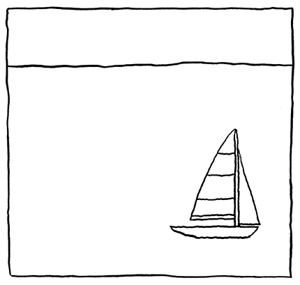
Rudolf Arnheim states that in an artistic space, “dynamics [vary] with direction” (30). Or to put it another way, location in a comics panel implies meaning. In the Famous Artists Cartoon Course Lesson 11, the instructors point out that the placement of a horizon line in a panel can affect the sense of depth and mood in a scene.

What’s interesting here, is that, for me, in each successive panel the figure seems to get nearer even though he doesn’t change in size. And if you think about it, this makes sense. The lower I am as a viewer, the more I will be near the eye-level of the figure. So the horizon will drop. If I pull away and up from the figure, the horizon line will likewise rise. In other words: close = low horizon, far = high horizon.
But this tends to work more generally. Forms that are lower in a panel appear nearer than those that are higher in a panel.

And again, this happens even if the forms are of the same size.

This also applies to weight. As Arnheim points out, gravity has taught us that objects are pulled downward. Therefor, forms that are higher in a panel will seem lighter. Ones that are lower will seem heavier.

The hot air balloon in the left panel is flying high and free. The one on the right seems to be running out of heat and so descending.
This also applies to potential for movement. Arnheim again is helpful: “the potential energy in a mass high up is greater than that in one low down” (30).

The ball in the left panel seems more precarious. The one on the right seems less likely to move. In both panels, it’s the same ball. The only difference is its placement within the panel.
Okay, to sum up some of the relationships that top and bottom placement in a panel can imply:
- far – near
- light – heavy
- energy – inertia
A related point to all this that Arnheim mentions is the study showing that when most people try to bisect a vertical line they place the midpoint higher than it actually is. Arnheim refers to several art pieces that look balanced but are actually not centered in order to deal with this perceptual issue. I don’t know a direct application for this, except, as Arnheim shows, that if artists want balance in their work, they have to take such visual biases into consideration.


